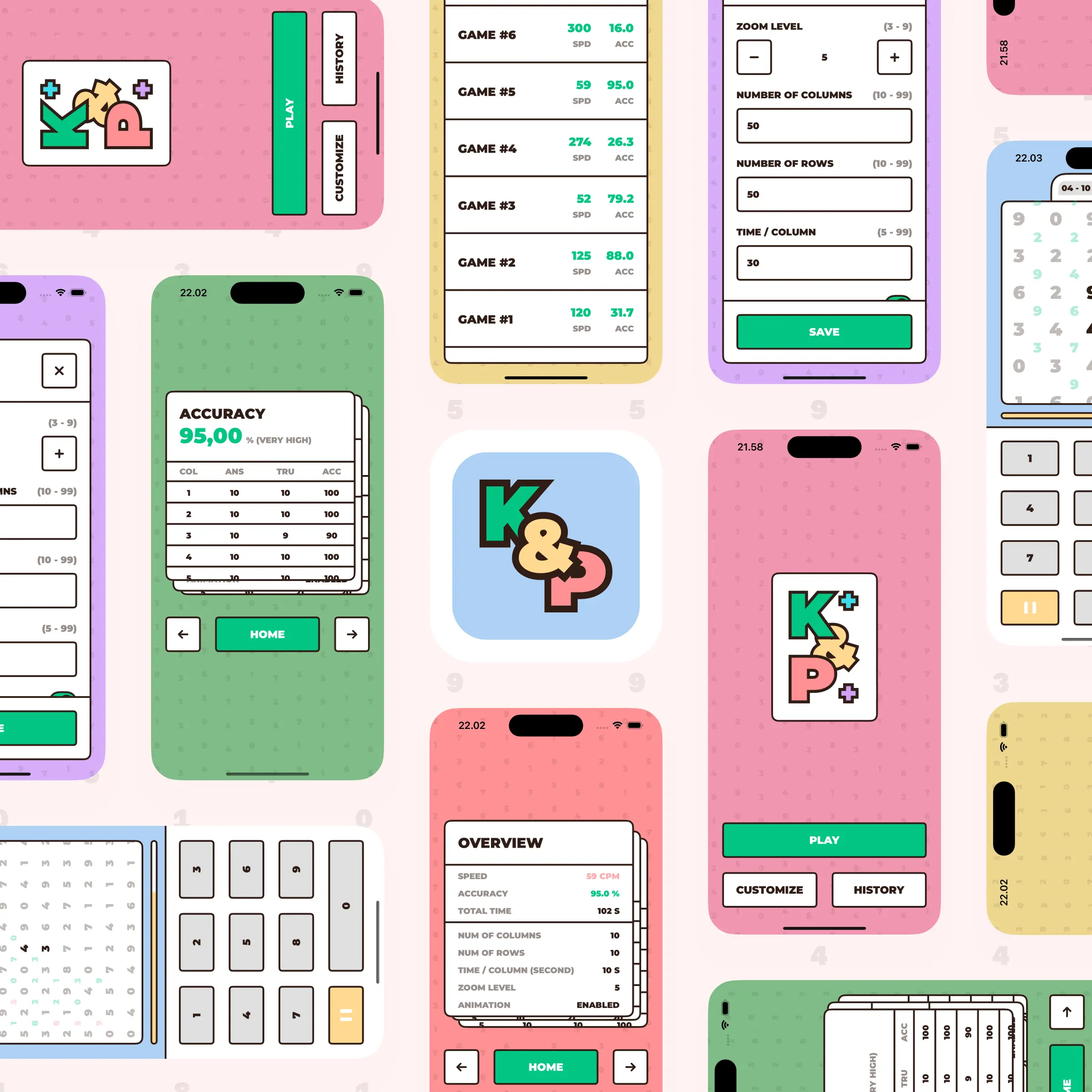
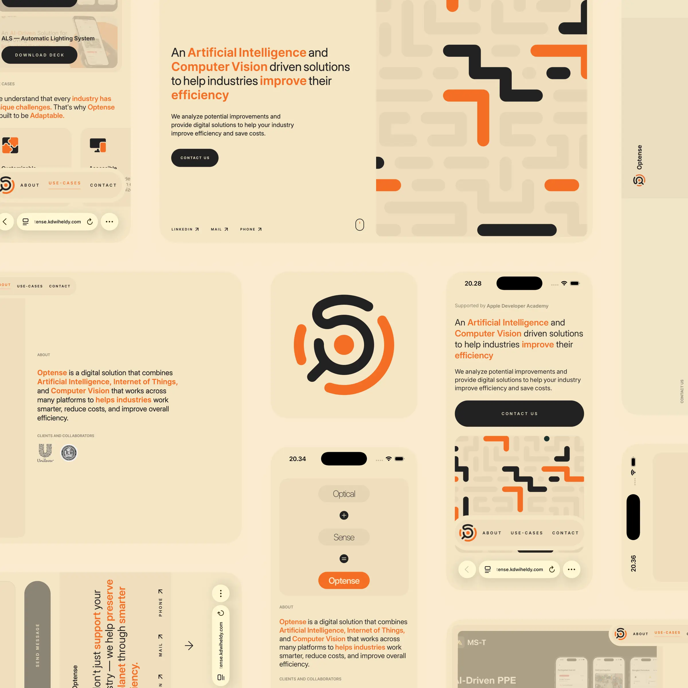
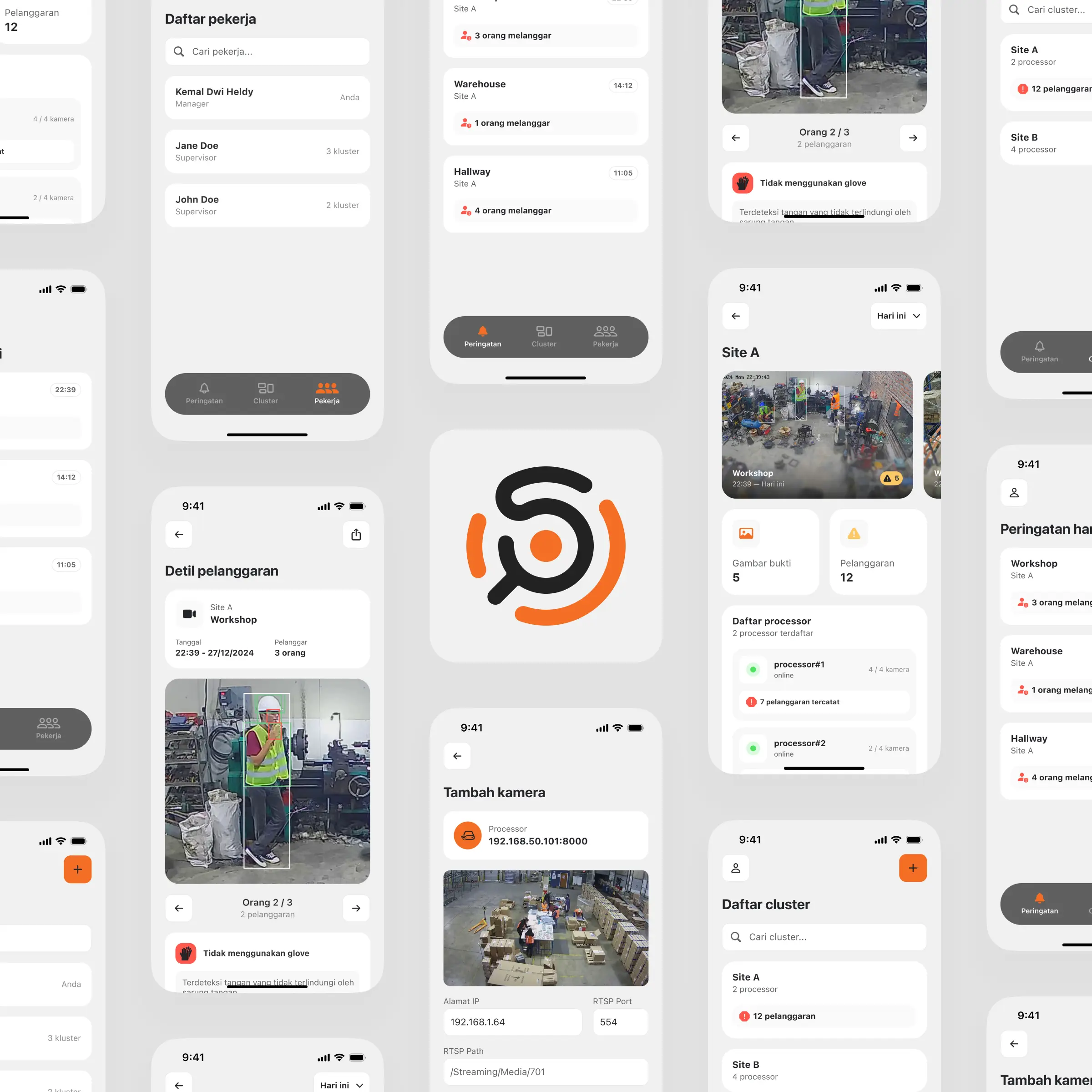
A brutalist, sideways-scrolling redesign of the ICOEN conference site, built solo in under 2 days for a contest, with the logo as the centerpiece.
Built solo in under 2 days for a redesign contest I did not win.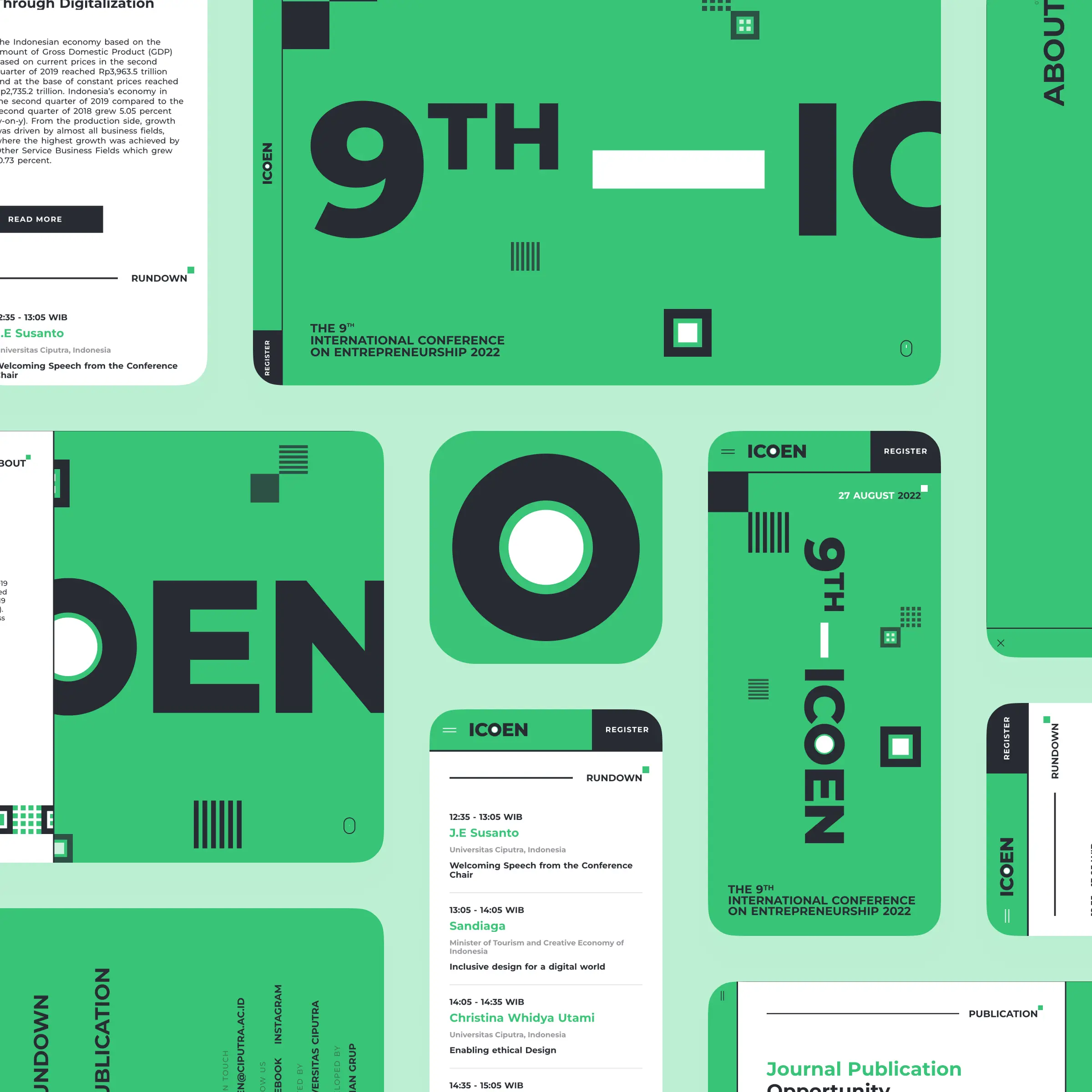
A friend sent me a 2-day contest to redesign the site for ICOEN, the International Conference on Entrepreneurship at Universitas Ciputra. I did not win, and I will be the first to admit the direction I chose did not really suit an academic event. But I loved the concept too much to let it disappear, so here it is, a solo build from start to finish in under two days.
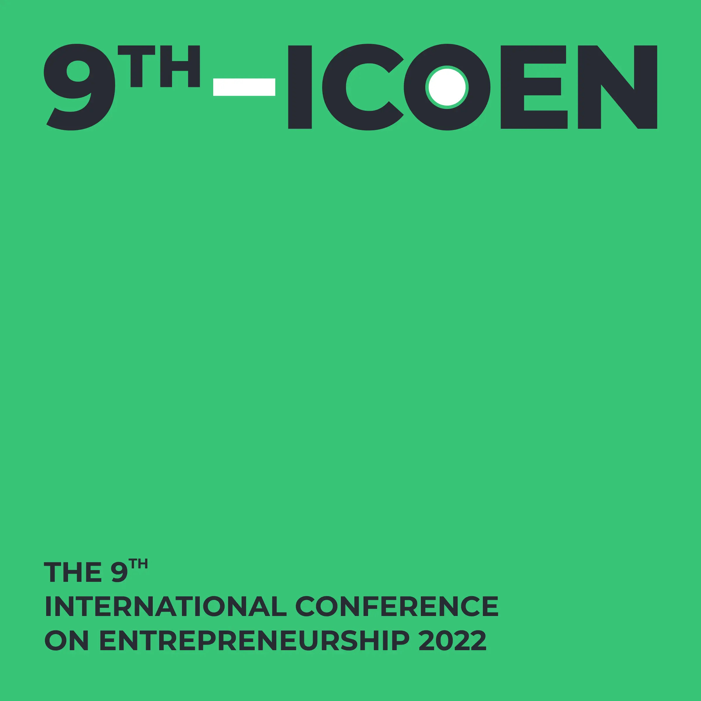
With the clock that short, I skipped hunting for something a committee would approve and chased a look I actually wanted to build. Two references were stuck in my head, a site that scrolled sideways and a piece of brutalist A raw, bold design style with heavy type and stark, unpolished layoutstypography, and the moment they met I knew the ICOEN logo itself should be the centerpiece. Everything else would orbit it. Big, loud, and unapologetic.
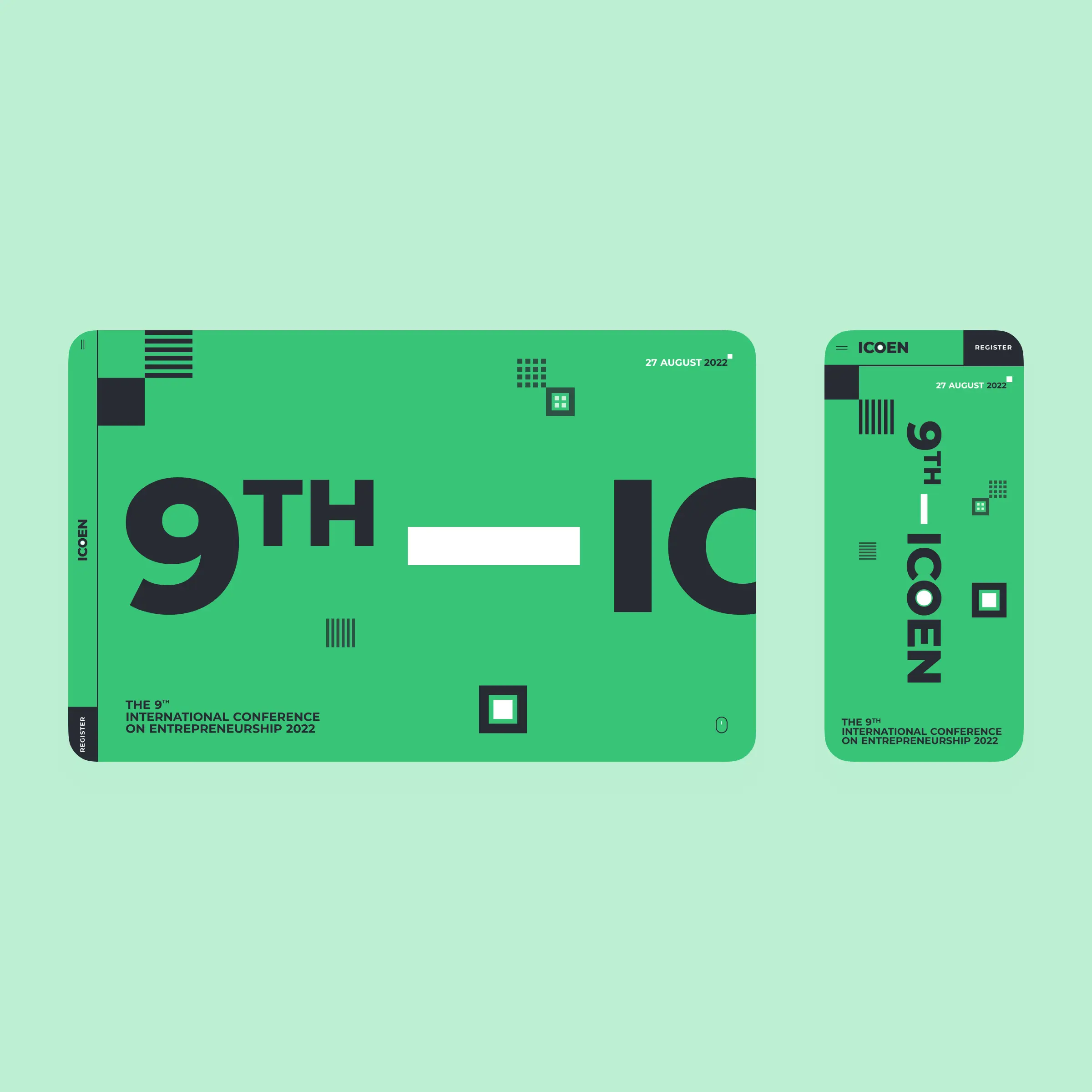
I kept the stack small on purpose. Nuxt, A framework for building web apps with VueGSAP, The GreenSock Animation Platform, a JavaScript library for high-performance animationSCSS, and a library called smooth-scrollbar. A JavaScript library for custom, smooth scrollingThe real work was the horizontal scroll. I had built sideways-scrolling pages before, so the fight was not the motion itself but getting smooth-scrollbar and GSAP to cooperate, which came down to choosing exactly which element should scroll and structuring its children so everything tracked correctly. Once that skeleton held, the rest was just making it pretty.
For content, I put myself in a visitor's shoes and kept only what earns its place. The about, the rundown of speakers, the call for papers, and the footer. Where a section needed more depth than two days allowed, I stayed pragmatic. The about's read more links straight to the official page instead of a custom modal I had no time to build.
My favorite moment is the very first one. The page opens on a bare green screen, then the whole composition animates into place, logo and all. That payoff is what made the two days worth it. The entry did not win, and honestly a concert would suit this design better than a conference. But it is still one of my favorite things I have made, and it taught me how much you can pull off with a bold idea and a hard deadline.