Case Study: iOS App at the Apple Developer Academy
Recreating the intensity of the tes koran, a fast-paced Indonesian math test, as my first Swift app. Built solo in 10 days, animated by hand.
My first Swift app, built solo in 10 days and animated entirely by hand.The Kraepelin-Pauli test, known in Indonesia as the tes koran (newspaper test), is a mental-math assessment that some companies use in recruitment. The math is simple. You add two numbers and write only the last digit of the sum. The catch is that you do it down a dense page of thousands of numbers, in silence, for a long stretch, which measures concentration, working memory, and stamina under pressure. I had taken it a few times myself and wanted to make preparing for it less of a chore. K&P was my entry for a solo Nano challenge One of the Academy's short, themed build sprintsat the Apple Developer Academy, a 10-day sprint on the theme of building an app that calculates something. It was also the first time any of us had touched Swift, since the previous challenge had been pure design.
Every online version I tried missed what actually makes the test hard. They show one pair of numbers at a time, and some let you peek at the next, so they train the arithmetic but never the real adversary. That adversary is the overwhelm of a whole page of numbers bearing down on you, with no going back. Recreating that feeling on a screen a fraction of the size of the paper was the real design problem, and I had to solve it in 10 days, in a language I had never written a line of.
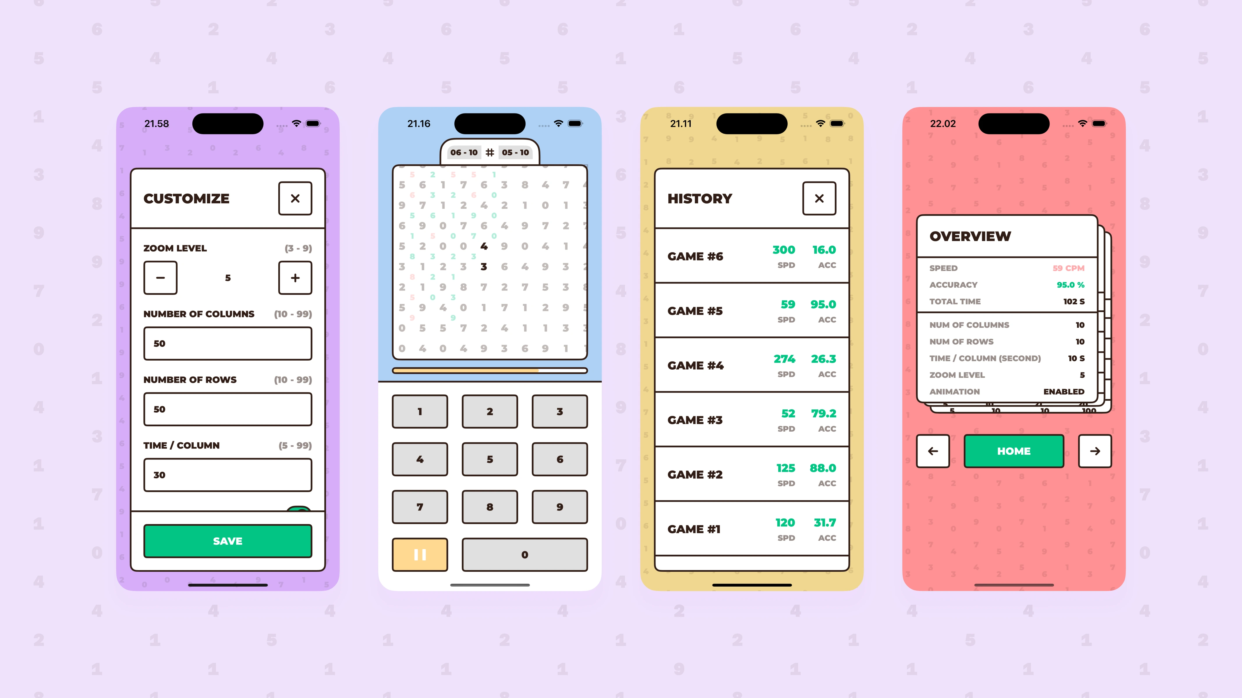
Instead of feeding numbers one pair at a time, I rebuilt the paper itself as full scrollable columns, exactly like the real sheet. The key idea was making the intensity adjustable. A zoom setting controls how many numbers crowd the screen at once, so you can dial the pressure from a gentle warm-up to something close to the real exam room. Answers go in through a custom on-screen keyboard. It does not capture the feeling of writing by hand, but paired with the wall of columns it gets far closer to the real thing than anything else I had found.
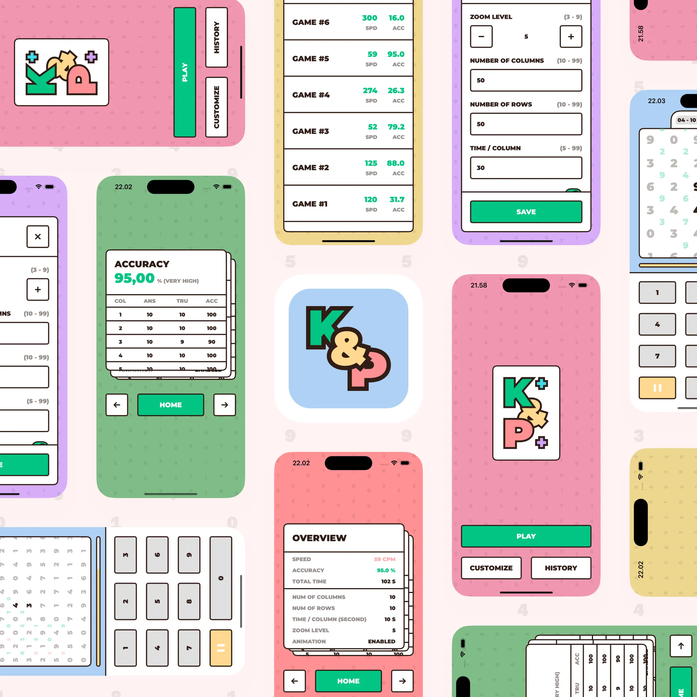
Underneath it all is what I called the moving background, the grid that is the test. Each column is a stack of square cells. I fill only the odd cells with numbers and leave every other column empty, so the spacing you see is really made of empty cells and empty columns, and the answers simply drop into those gaps. Once the numbers lined up, I animated the whole grid shifting as you play, and that is where I had the most fun. As a first-time Swift user I hand-crafted every animation, from the menus to the pair and column shifts as you answer, up to a score screen with three cards you can flip between. I tuned the input to an ease-out spring at 250ms so it felt smooth yet snappy. The trick to learning it quickly was porting a habit from GSAP. The GreenSock Animation Platform, a JavaScript library for high-performance animationI break an animation into a timeline of steps, then rebuild each step by hand in SwiftUI. Apple's declarative framework for building user interfaces across its platformsIt is rawer and more manual, but it is the same way of thinking.
At the academy's demo day, mentors and peers were struck that this came together in 10 days, and honestly it was the animations that stole the show more than the mechanic itself. More importantly, K&P is where SwiftUI finally clicked for me. The layout and animation fundamentals I fought through here carried into everything I built afterward. The app is finished, and the last step before release is a round of polish for the App Store.