The public face of Optense, our computer-vision and industrial-automation startup. A fast, horizontal-scrolling teaser, animated with care.
A horizontal-scrolling teaser for Optense, built in about 10 days.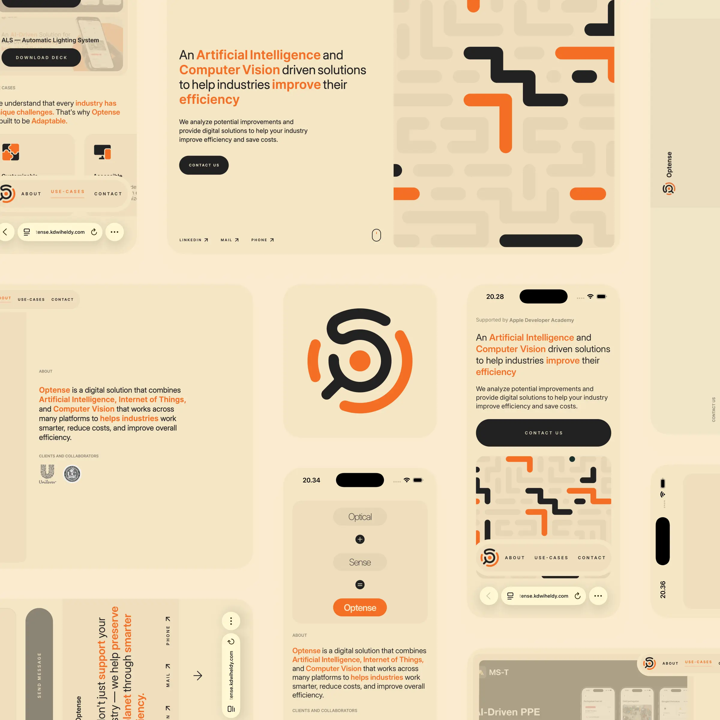
Optense is a computer-vision and industrial-automation startup my team and I built out of an Apple Developer Academy project. This is its landing page, the public face I made to give it a presence and a way for people to get in touch. It stays deliberately high level. The real depth lives in the products themselves, which each get their own case study. I will be honest, I wanted the page to walk through every product in detail, but without a dedicated designer and with limited time, it ended up more of a confident teaser than a full story.
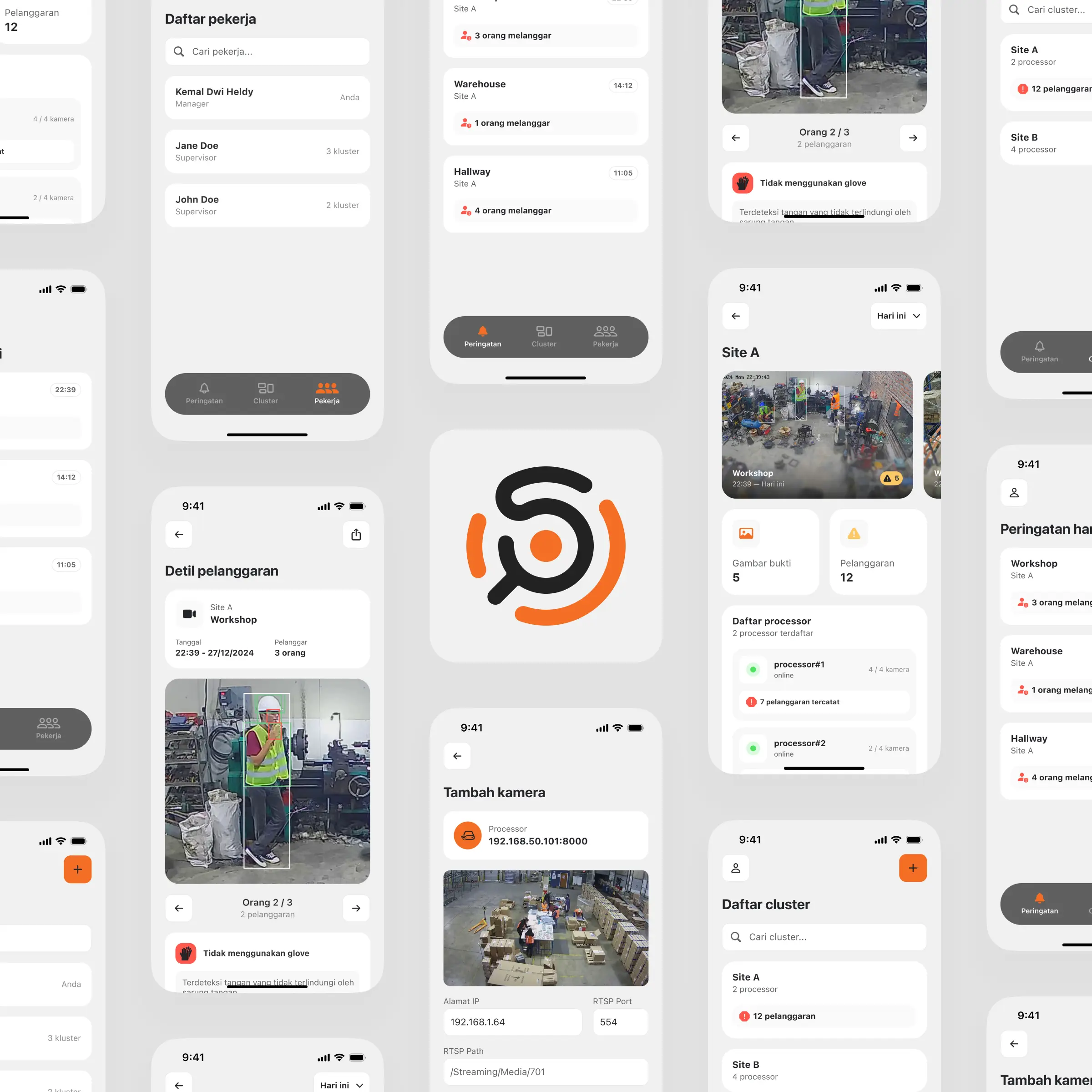
A teammate designed the Optense logo, and I took it from there, refining it and building the rest of the identity around it. The palette is a warm cream with orange, gold, and black, a deliberate move away from the cold blues most industrial-tech companies reach for. The orange is the key. It carries the feeling of being watched or warned, but without the aggression of red, which fits a company built around monitoring and safety. I also drew the circuit-like motifs that run through the page to hint at the technology underneath.
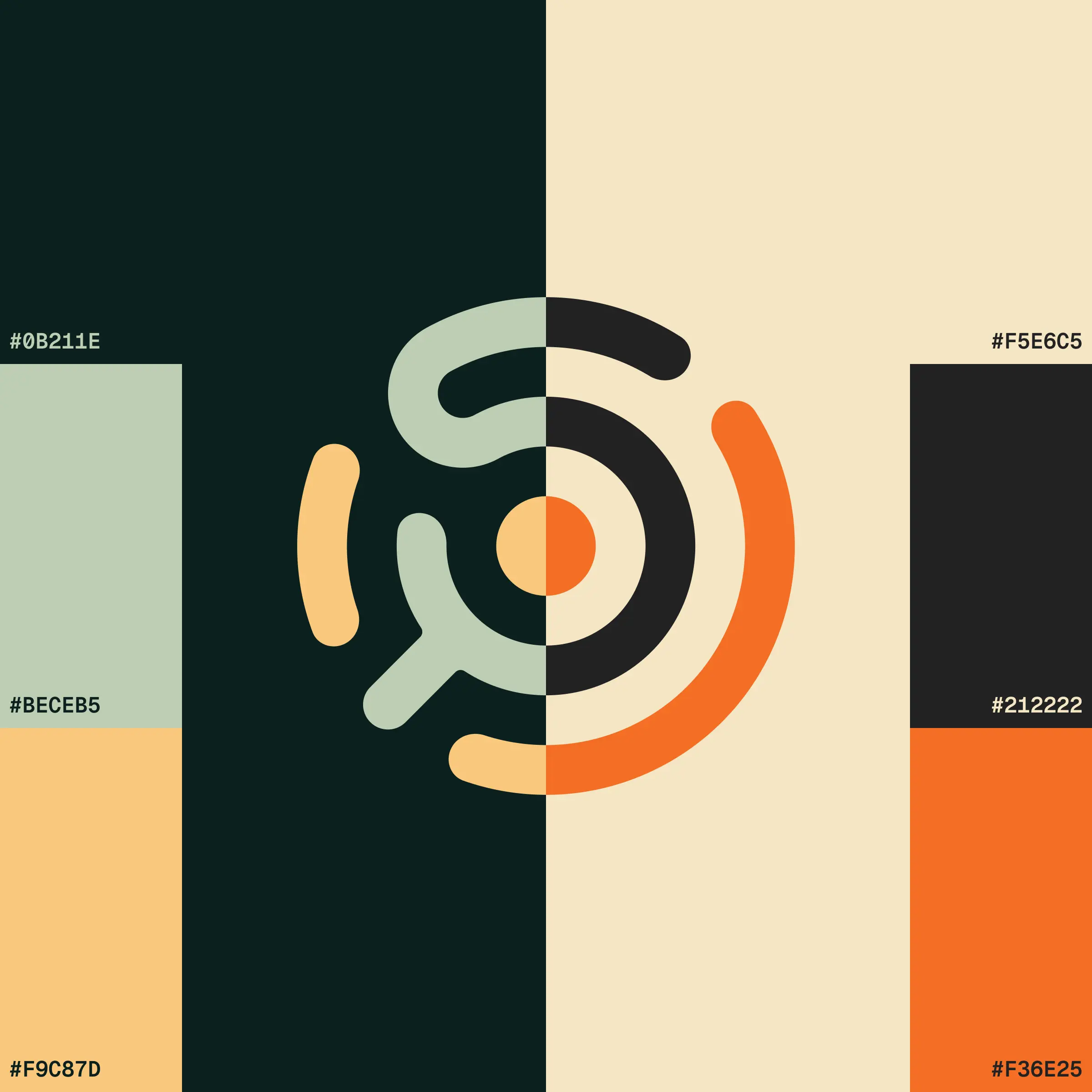
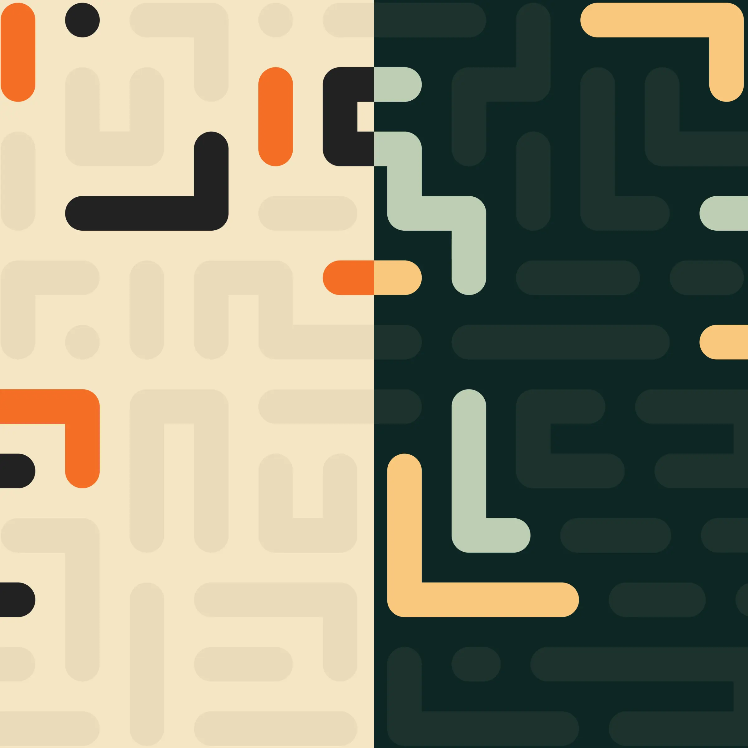
I reused the horizontal-scrolling approach I had built for ICOEN, but this time I reached for GSAP's The GreenSock Animation Platform, a JavaScript library for high-performance animationScrollSmoother A GSAP plugin for smooth, inertia-based page scrollingplugin, which became free when GSAP went fully open last year, instead of the smooth-scrollbar A JavaScript library for custom, smooth scrollinglibrary I used before. Ironically the landing page took me about 10 days, far longer than ICOEN, almost entirely because I could not stop second-guessing the design. It is also server-rendered, so it loads fast and looks right when shared.
The part I am proud of is the motion. The page loads with a skeleton-to-text effect, each section reveals as you scroll across it, and even the navigation bar has its own animation. None of it delivers hard value, it is eye-candy, and I am at peace with that. Sometimes a company's first impression is the whole point.